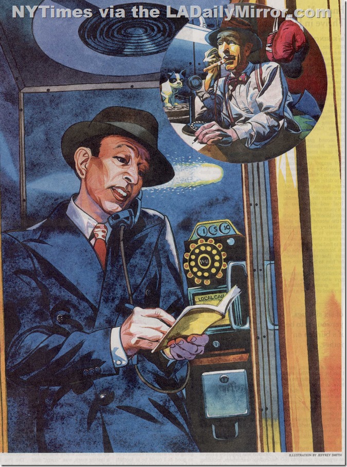
This illustration by Los Angeles artist Jeffrey Smith appeared in the New York Times on Jan. 16, 2016, accompanying a story about an elaborate hoax that occurred in 1941. Who can spot the mistake?

This illustration by Los Angeles artist Jeffrey Smith appeared in the New York Times on Jan. 16, 2016, accompanying a story about an elaborate hoax that occurred in 1941. Who can spot the mistake?
Comments are closed.

Well, for one, there are 12 holes in the dial of the pay phone, and no finger stop. The same thing is true of the dial on the candlestick phone in the inset picture. The whole dial isn’t visible, but nine holes are showing, and that’s not even half the dial, so that dial may have more holes than the pay phone!
LikeLike
More than ten holes on the rotary dial.
LikeLike
The pay phone, which is from a different era than the other phone, doesnt have a proper receiver, ie hook.
LikeLike
Too many “digit holes” on phone and wrong phone altogether. A postwar Western Electric offering, I think.
LikeLike
The pay phone is a 1960s model, not a 40s model.
LikeLike
The elaborate hoax in 1941 was probably the stunning football victories of the mythical Plainfield College team concocted by a couple of sports writers who wanted to see how gullible their colleagues were, when they telephoned them with the scores of weekly games that the mythical school played against other mythical schools. The evident ¨error¨ of the recent illustration is the illustration of the large phone booth, which looks more like the 1980s than 1941 (overhead light, stylish box and dial, square metal coin box, etc.). The inset picture of the sports news editor with ¨candlestick” phone looks fairly correct for 1941.
LikeLike
Too many finger-holes on the dial.
LikeLike
The phone cord. Its the metal variety and was not used until I believe, the 60’s.
LikeLike
The dial on the phone in the booth has 2 too many number holes.
LikeLike
12 holes in the dial?
Ball point pen (not invented until post WW2)?
LikeLike
I have to go with the phone, too. Frankly, the entire pay phone setup looks wrong to me. It looks more like a 1970’s one than an early 1940’s one. And I know it’s supposed to be the reflection of a streetlight, but it looks like a comet behind the man in the phone booth. I’m personally not a fan of the illustration either.
LikeLike
Too many finger-holes on the telephone dial!
LikeLike
The guy in the photo has a mustache in the inset and he is clean shaven in the larger photo?
LikeLike
They are two different people. It’s an old comic book technique. The guy in the inset is the person the guy in the main picture is talking to on the phone. (Yes, I wasted my youth reading comic books.)
LikeLike
You wasted your youth reading comic books.
Didn’t we all?
LikeLike
The guy is writing left handed in one photo and right handed in the other! That’s why Call and Lulu are such good detectives!!!
LikeLike
I think it’s the coin slot amounts. For the 1940’s they should read from left to right: 25¢, 10¢ and 5¢. The slots are hard to see because the image “label” stamp is directly over the slots, but to me it looks like they read: 10¢, 5¢ and 1¢, which would not be correct for the time period.
LikeLike
The penny coin slot was the very first thing I noticed.
LikeLike
He’s writing with both left and right hands!
LikeLike
Too many finger holes in the dial.
LikeLike
I guess the editor at the Times who signed off on the illustration was talking to his bookie.
LikeLike
The phone is the main item with several discrepancies noted already, also the phone’s vault door is chrome and there is a coin return button which were not on 40’s phones.
LikeLike
This has nothing to do with the hoax or the mistake, but the guy in the phone booth resembles Lloyd Nolan.
LikeLike
Candelstick phones did not have a dial, you rang a switchboard operator to connect you. Also, what comet is that supposed to be in 1946?
LikeLike
Big city phones had dials, little burgs (like the one where I grew up) had an operator who greeted you with an enchanting “Number, please.”
LikeLike
Fluorescent desk lamp.
LikeLike
Anyone notice that bigdamn comet in the sky behind the guy’s head?
LikeLike
The boxing gloves.
LikeLike
The insert has the man sitting under a fluorescent light. I believe that is an anachronism.
LikeLike
Why is there a comet flying by?
LikeLike
the BIC pen
LikeLike
The hole for the dime is bigger than that of the nickel and penny. It should be smaller.
LikeLike
Fluorescent light in the office?
LikeLike
His tie is tied with an overhand Windsor knot Kennebunkport variation, which was not introduced until the late ’60s.
LikeLike
Dimes aren’t bigger than nickels.
LikeLike
I think it’s the comet
LikeLike
I think it’s the comet.
LikeLike
Comet.
LikeLike
Since when are pennies and dimes larger than nickels?
LikeLike
The guy on the right is under a fluorescent lamp. While they were available as early as 1938, they wouldn’t be in a gym or small office.
LikeLike
Interesting replies. I twigged the penny slot and thought the 12 digits was wrong. Then I Googled it and found a pix of a 12 digit phone (the extras were * and #). This might be the photo the artist used:
Interesting calls on the telephone booth design and the fluorescent lights.
LikeLike
ElQuinto cigars weren’t produced until 1958.
(What? Well, my real observations were already taken.)
LikeLike
there are 12 digits/holes on the telephone dial instead of 10. The 12 digit (or duodecimal) numeric system was not commonly adopted until the late 43rd century
LikeLike
The denominations are in reverse order – they should increase from right to left. Second, I believe the single-piece receiver is wrong and should be similar to the two-piece design of the candle stick.
LikeLike
Guy sucks as an illustrator or deliberate: the upper part of the phone and the dial appear to be facing a few degrees to our left while the lower part with the coin box appears to be a full frontal view. Is that it? Is that it? I was so disappointed when I saw others saw the coin size discrepancies already, I looked reel hard to find another one. Or, I am just a lame loser. Fun post!
LikeLike