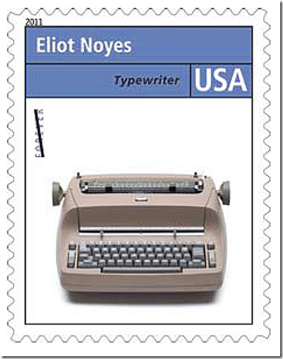
Photo: IBM Selectric commemorative stamp. Credit: U.S. Postal Service
Today’s post on the IBM Selectric got me to thinking about the variety of interchangeable typeballs that were used for fonts. The most memorable was ORATOR, which looked like this:

Photo: ORATOR sample. Credit: Selectric.org
ORATOR was used almost entirely for labels. Any other use (newsletters, correspondence) was really loathsome.

Photo: Script sample. Credit: Selectric.org
Script was another hideous Selectric font. Other than ladies’ correspondence, it had no use whatsoever and was hard to read. Just imagine getting a four-page letter in script. Young people: Think of a letter as a 1,000-word tweet. OMG!

Photo: Courier sample. Credit: Selectric.org
Before I got into the newspaper business I worked as a clerk-typist and most of my time was spent with Courier. Quite honestly, I didn’t like the Selectrics much because the ball couldn’t keep with my typing. And, of course, the Selectric II with correcting tape was far superior. It was a great day when my employer finally got one for the office.


Remember the Selectric very well… I used the Orator font primarily for speeches and overhead slides (in those pre-Powerpoint days). If you had a collection of typeballs, you could insert italics when necessary, accent marks and umlauts and mathematical symbols. This was all before word processing, of course.
LikeLike
@Roger: Yeah and the typeballs were expensive, as I recall.
LikeLike
The ‘typeballs’ were called “Elements” and depending on the font were priced around $25.
I worked for IMB at that time – The Selectric 1 sold for almost $900 each. Selectric II were available as dual pitch (10 or 12 spaces to the inch) and had a self correcting (lift off) capability – and sold for $1,000. With one element. Courier.
http://en.wikipedia.org/wiki/IBM_Selectric_typewriter
It was a fun typewriter to use and fix!
LikeLike
@Latigo: In my days as a record collector I picked up an LP of one of the IBM shows. It was all about selling typewriters and it was hilarious. Very elaborate with music, like a Broadway show.
LikeLike
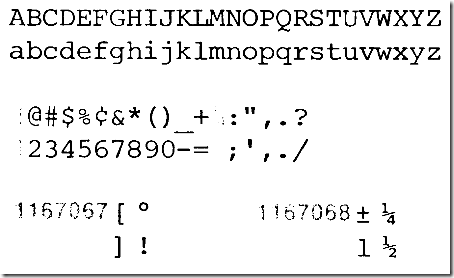
Just a few days ago I was thinking of the Selectric optical character recognition (OCR) font. In the days before computers would do an excellent job of converting most print into a digital format, the OCR readers could only read the OCR font, which was an ugly thing with tiny black blocks in strategic places on the letters. I was in the Air Force at the time and the ability for the communications centers to scan a document directly into inter-base communications systems was a giant leap from preceding system where everything had to be composed on a Model 28 Teletype onto punched paper tape for later transmission.
LikeLike
At roughly the same time, IBM also offered a typewriter with proportional spacing, where an “i” or “l” didn’t take up as much space as an “m” or “w.” Used to love using that machine in my high school typing class in 1972.
LikeLike
@Vincent: The summer after we graduated from college, we took a typing class at one of the local high schools and learned on a bluish-green Underwood manual typewriter. The teacher wrote a Bible passage written on the blackboard every day that we used in addition to the typing manual. And unlike the rest of our college education, we use what we learned in typing class every day.
LikeLike
Thanks for posting a copy of the OCR font. My recollection of the appearance was obviously fogged by the 25+ years since I’ve seen it.
The IBM Executive was a model that had proportional spacing. I still remember the work my mom went through when the text needed to fully justified. First you type the page, then take a special ruler to decide how many portions of a space needed to be added to make the right side of the page even, then retype, adding partial spaces to several of the spaces within each line to lengthen the line by the requisite amount.
Around the same time IBM offered a magnetic card typewriter. The memory was on IBM cards with a magnetic strip down one side. If I remember correctly, each card held one line of text.
The model I learned on, and the one I had for many years was a grey manual Underwood Touchmaster 5.
Larry, I agree with you on the value of typing classes. My typing classes were in high school and I think I got an F one semester and D another. Despite that, I apply the skills learned in those classes several hours a day and rate typing to be one of the most valuable classes I took in high school. (And it could be more valuable than any of the classes I took toward’s a bachelor’s degree and a couple of graduate degrees).
LikeLike
For years the “shop number” on the front doors and lower trunk lid of LAPD radio cars was in the OCR font. Check any ca 1968 “Adam-12” publicity still to see it.
LikeLike
We used Selectric Script for award documents on the USS Harlan County. I had a nice look, and I was able to read it.
LikeLike